The Farms
Identity Design
The Farms is a brand that is home to natural, fresh, and certified USA and EU organic food products.
The new mark is a reflection of what The Farms stand for, that is to provide fresh, natural, organic, and premium products.
The serif and all-caps letterforms give a premium and modern feel to the mark. The arm of the letter “T” in the word “The” is curved from one end and the leg of the letter “R” is extended like a plant to give the mark a natural and organic feel.
These nuances result in a wordmark that is scaleable, bold, and yet elegant.

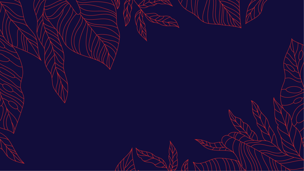


Since the brand revolves around nature, we decided to extract patterns and colors from the objects present in nature.