Peepu
Brand Identity Design
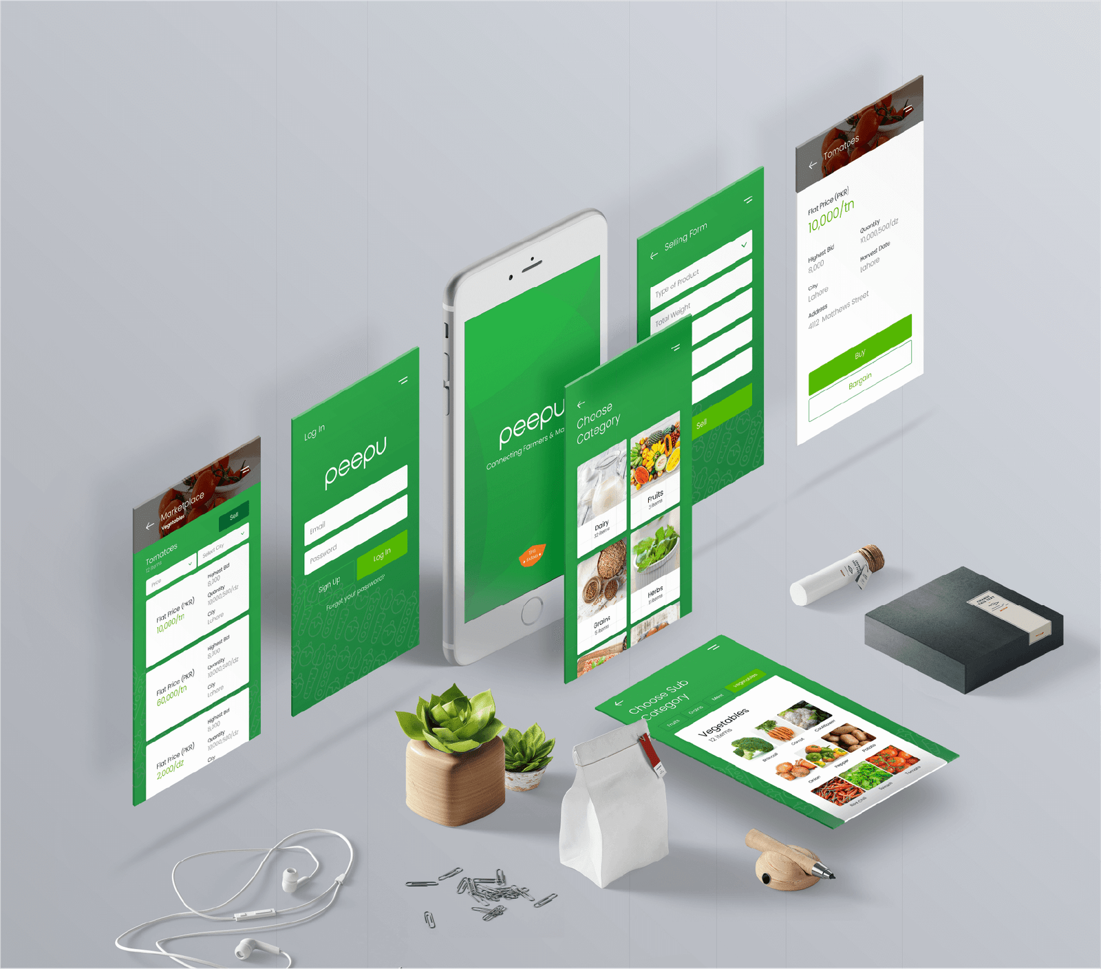
Peepu is an agri-tech startup that aims to connect farmers and markets via its mobile app.
Peepu’s wordmark is designed to convey trust and a friendly emotion to its target audience. Hence, the letterforms are all lowercase and are uniformly rounded.
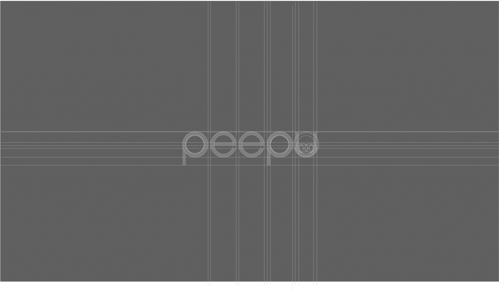


The merging circles in the App Icon signify the collaboration between farmers, middlemen, and end-users. Since all of the operations are handled by Peepu, therefore, its symbol is at the center.

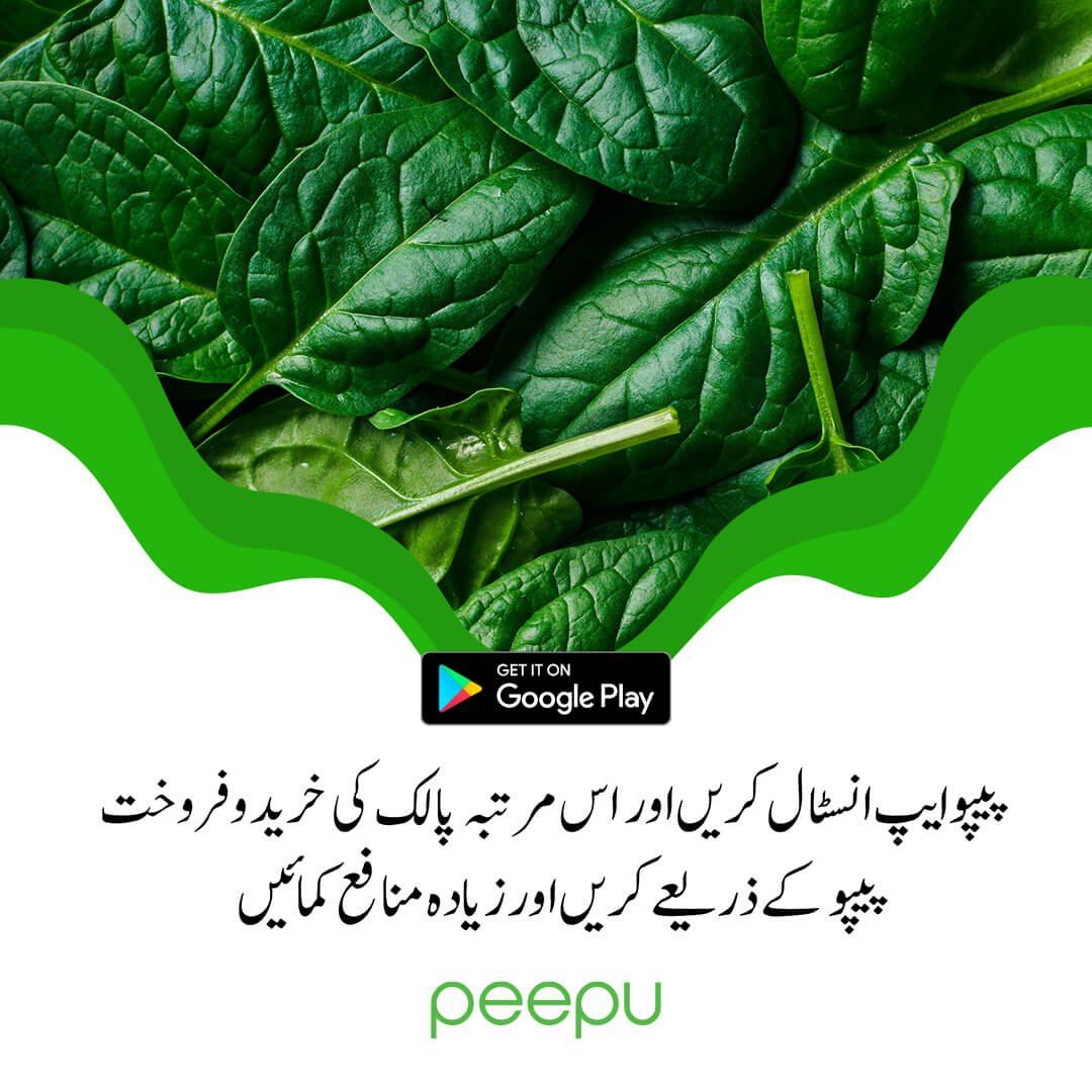
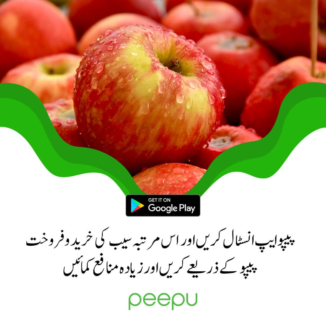
Social Media Posts
Some of the posts we had designed to promote Peepu’s services.